
EDUCATIONAL DESIGN TOOL
StudySync Poster Creator
Create study-note posters with uploaded images, layout controls, text and background settings, image effects and export options.
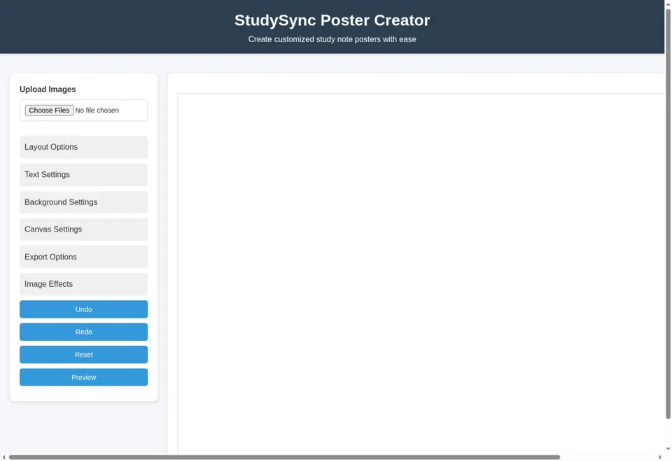
- Upload images and arrange a study poster.
- Adjust layouts, text, backgrounds, canvas and effects.
- Undo, redo, reset, preview and export controls.
Image layouts · Canvas settings · Poster export
Open live preview ↗Live preview loads when this card comes into view.
01 / A CLOSER LOOK
A creative tool needs reversible choices
An image or poster editor combines several kinds of state: uploaded assets, layout choices, text, background, effects and export settings. A useful workflow lets someone understand what is selected and see the consequence of a change before committing to an output. Undo and reset serve different purposes and should communicate the amount of work they affect.
The resulting file also matters. A preview on the screen is not the same as an exported image, so a review should consider dimensions, aspect ratio and how readable the content remains outside the editor. StudySync exposes controls for these tasks in its public interface. This describes the observed tool and the questions worth reviewing; it does not add unverified format support, cloud storage or collaboration features.
02 / A CLOSER LOOK
Design an interface around its task
A useful interface makes the next action understandable. Labels should explain the information being requested, navigation should match the user’s context and a screen should show whether information is loading, empty, saved or unavailable. A responsive layout also needs to preserve the order and meaning of content rather than merely shrinking a desktop view.
Frontend work connects these states to real backend behaviour. A form should display validation next to the relevant field, a list should make filtering understandable and a destructive action should explain its consequence. Keyboard focus and touch target sizes affect whether someone can complete the journey comfortably. The portfolio lists JavaScript, React, Vue.js and Laravel Blade as part of the toolkit; the right interface approach depends on the surrounding product.
03 / A CLOSER LOOK
Readable and accessible by default
Accessibility starts with ordinary design choices: readable text, meaningful headings, descriptive links, visible focus and controls that can be reached without a mouse. Images need useful alternative text when they communicate information. Decorative imagery should not repeat information that the surrounding text already explains.
A long page benefits from an overview, clear section headings and links that let visitors move to the material they need. On a small screen, navigation must remain available without covering the content or forcing horizontal scrolling. These considerations improve a recruiter’s quick review as well as a visitor’s detailed reading. Testing should include the actual rendered layout, since correct-looking markup alone does not show whether a control is visible or comfortably usable.
04 / A CLOSER LOOK
Validation that helps a person recover
Validation translates the requirements of an action into checks on the data being submitted. It covers required fields, permitted formats, allowed choices and relationships that must exist. Browser checks can provide immediate guidance, but server-side validation remains necessary because requests may arrive through another client or an edited form.
An error response should identify the affected input and provide a useful correction without exposing internal details. The interface should preserve appropriate entered values so that a person can fix one mistake without repeating the entire task. Success feedback should appear only after the intended operation has completed. Thinking through missing, duplicate and unexpected input is part of defining the workflow, not a separate cosmetic step after the screen is built.
05 / A CLOSER LOOK
Performance is part of the user journey
A page feels responsive when useful content appears promptly and controls react without unnecessary waiting. Large images, repeated network work and expensive interface updates can each affect that experience. It helps to separate the initial page load from later interactions, because an improvement to one does not automatically improve the other.
Images should have appropriate dimensions and be compressed for their display size. Content outside the initial view can load later where that does not hide information the visitor needs. Layout should reserve space for media to reduce unexpected movement. A measured review needs a specific page, device and network condition; a fast development machine is not evidence that every visitor receives the same performance.
06 / A CLOSER LOOK
Review the complete journey
A screen can appear correct while the underlying workflow is incomplete. A useful review follows a record from its first creation through validation, persistence, reload, later edits and any linked action. It also checks what happens when a field is missing, an external service fails or a user attempts an action that their role does not permit.
The depth of testing should match the consequence of a mistake. An informational layout needs readable content and working navigation; a payment or permission change needs closer checks around state and access. Review notes should make the expected result visible, explain the conditions used and distinguish a verified outcome from a limitation that still needs attention. This is a review approach, not a claim that every historical project has identical test coverage.
07 / A CLOSER LOOK
Learning through practical work
Computer Science and Engineering provides a foundation in data structures, databases, software design and the reasoning needed to break a problem into smaller parts. Practical development adds another layer: requirements are incomplete, existing data has history and an apparently small screen can depend on several business rules. Connecting those two perspectives helps turn an exercise into a maintainable application.
A useful learning habit is to build a small working example, explain why it behaves that way and then test a case that challenges the original assumption. Reading code, reviewing a change and writing down a trade-off make that understanding easier to share. Qualifications and community milestones are listed as documented; this page does not add certificates, scores or credentials that have not been supplied.
08 / A CLOSER LOOK
Turn a page into a useful conversation
If this subject relates to your requirement, describe the closest example and the part that differs in your own application. An enquiry about an API might include its current consumers and expected response; an enquiry about a dashboard might describe the records a role should see. A recruiter can point to a project or responsibility they would like to discuss in more detail.
You can contact Raju by the email, phone or WhatsApp links published on the portfolio, or use the enquiry form. Include the role or project type, preferred working arrangement and any important timing constraint. A clear first message makes the next discussion more focused. Availability, price, ownership and delivery arrangements are agreed for the specific opportunity rather than assumed from a general service page.